Wednesday, December 30, 2009

Economical and Accessible Art!

I am always on the look out for artists who create work that can inspire fabulous lessons using economical and accessible materials. And Rebecca Ward is a new find for me that fits the bill.
seventeen is sharp, kansas city, charlotte street foundation, electrical tape, paragraph gallery

domy books, houston, rebecca ward, electrical tape
Made with electrical tape!! So gorgeous!

Monday, December 21, 2009

Cut Paper Love!

I have been musing over some cut paper/altered book projects for a while...I am dying to develop a lesson plan that really immerses students into the techniques of cut paper and altering books, but it will have to wait until I have students for more than a day a week. If I did have my own classroom and I happened to be conducting a lesson on such artistic mediums in New York City, I would take my class to see this exhibit at the Museum of Arts and Design that opened several days ago.

Slash: Paper Under the Knife takes the pulse of the international art world's renewed interest in paper as a creative medium and source of artistic inspiration, examining the remarkably diverse use of paper in a range of art forms. Slash is the third exhibition in MAD's Materials and Process series, which examines the renaissance of traditional handcraft materials and techniques in contemporary art and design. The exhibition surveys unusual paper treatments, including works that are burned, torn, cut by lasers, and shredded. A section of the exhibition will focus on artists who modify books to transform them into sculpture, while another will highlight the use of cut paper for film and video animations.

A work by one of my favorite artists, Brian Dettmer, from the show.

Making History Visible

In the photographic series “The Green(er) Side of the Line,” Alban Biaussat documents places and spaces along the Green Line of the 1949 Rhodes armistice agreement, and thereby shows the improbability of separating the physical space of a family’s back patio or a local butcher’s shop that happens to be on the line.
The Green(er) Side of the Line

(Biaussat was born in Paris in 1970 and though he has an MA in photojournalism and documentary photography from the London College of Communication, he also has had a postgraduate level of education in business studies and international relations.)

"In the Middle East, new political concepts, initiatives and slogans are plenty, supplementing each other month after month as the previous ones exhaust themselves, but there is one reference that has borne a sustained potential for visualization, if not for political vision: the Green Line. It is, it seems, well enshrined in people’s minds, whether they like it or not, as a valid political reference.

Since the Oslo years of the 1990s, the 1967 “border” has become the orthodox reference for negotiating the final contours of an improbable “viable” Palestinian State – or, as some would probably prefer, of a viable continued Israeli occupation. Consistently represented in green on a series of geographical maps, it has emerged as the Green Line, attributing also political and legal in/correctness to a series of issues, such as Israeli settlements. Most people would probably assume that the 1949 line has remained the same till 1967. This overlooks the fact that the line has moved during this period. Its position has been continuously affected by the military and economic tactics of the parties and their desire to push the real “line” to the other side of the armistice “zone” where there was one, as is particularly the case in the Golan and near Latrun.

I decided to make the Green Line appear. Photography would be my magic wand.This project thus intends to instrumentalise the visual nature of this political concept and wants to be a gentle, yet absurd, kick in the big green eyes of the so-called solution of “two States living side by side in peace and security along the 1967 border.” By doing so, it intends to communicate, with a smile, a sense of absurdity when envisaging the likelihood of establishing borders in this landscape, if such a thing is possible at all. More interestingly, it is about showing the physical landscape of possible political separation, as was the case in the past, and about generating critical thinking and a healthy feeling of doubt to keep the door open to alternatives."

-Alban Biaussat about his series "The Green(er) Side of the Line"

The Global Contexts of Vik Muniz

As a proponent of place-based education, and lover of community mapping through art, I have been drooling over the new book release, The Map as Art: Contemporary Artists Explore Cartography. In this book, I came across this work by Vik Muniz that has excited me and caused me to research him further.
WWW
WWW, 2008 (WWW is a photograph of an installation work made of electronics and computer parts.)

Vik Muniz is from a working class family in San Paulo, Brazil and calls himself, “a Hugo Chavez of the art world,” going on to say, “I want to make populist art that anyone had access to…if I knew how dogs look at things, I would make art for them, too.” He uses everyday objects, such as sugar, diamonds, chocolate syrup, and thread, to create massive scale installations that represent people or places that he then photographs.

Muniz has said that many people are “numb to representation” and his work is inviting people to look beyond what his pictures depict and focus on the acts of making and viewing art. His work and objects connect to the places in which they were made or places they reflect on, such as the Sugar Children series, that consists of sugar portraits of children of Caribbean plantation workers. Muniz has also created the Centro Espacial center in Rio for the art education of the shantytown youth, whom which he enlisted help in creating his large-scale Pictures of Garbage series.

I plan to create some lessons based on the work of Muniz and teach them in my fieldwork sites, so expect some follow-up posts to come!

Thomas Doyle


FirstAid1

FirstAid2

An artist near and dear to my heart, is Thomas Doyle, who creates miniature sculptures of strange and dark situations in snow globes or various containers of sorts. His artwork, that focus on setting a scene and displaying a narrative, can be of great use in the classroom.

Wednesday, September 23, 2009

Teaching Resources

Of all the teaching resources to be found online, I am most excited about these few fun and free tools that could be put to great use by artist teachers!
  • Xtranormal Text-to-Movie is great little program that lets you and your students, imagine up little movies and create them for free, using your own script and direction. Choose your actors, their accent, their actions, their words, the set, the music, just about everything! An easy and effective tool for visually teaching ideas or letting your students express their own ideas and understanding through.
  • Classroom Architect provides a super easy platform for creating and planning your classroom floor plan. It lets you save several plans and print them with the click of a button. A super useful tool for teachers with limited space! Here is a sample floor plan I threw together:
  • Picnik is a quick and dirty photo editing program that is both free and requires no software! Simple and easy edits can be done right there in the browser!
  • Art Babble is a fabulous resource for artist teachers striving to add some contemporary media to their lessons. It the youtube for all things art! From full length artist lectures from places like the Hammer Museum to new interviews and footage of artists like Catherine Opie to artistic research video such as those done by the Van Gogh Museum, it has so much to offer to those of us teaching in the arts! I'm fond of this clip of photographer, Henry Wessel, talking about his photographic process, shooting from cars.
  • Skitch is one of my favorite tools, that makes creating powerpoints, visual aides, and blogging so much easier! Not to mention, making image sharing fun! Skitch takes screenshots of your desktop, browser, or whatever you happen to be looking at on your computer. Not only can you quickly grab these images, you can add arrows, captions, and sketches to these images. Jing is a similar free service that also takes screen videos in addition to still images, but the Skitch application comes with an adorable pink heart icon, how could you say no?

Tuesday, August 18, 2009

Old news....

The discontinuation of Polaroid film is clearly old news, but my wounds are still very fresh months and months later. I love this article with the audio component of Polaroid photographers, so I wanted to share it.


Thursday, June 25, 2009

Neato Neto!!!

Forgive me for not posting in a couple months, after spending a year wrapped up in arts education, I took a bit of a break and have been putting my blogging efforts into something a little different. But I am slowly getting back in the art ed groove, so here is some art love to share!

Check out this post at the blog, Sweet Fine Day.
Ernesto Neto had an installation in NYC at the Park Avenue Armory that is out of this world! I want to live in it!


Monday, April 27, 2009

A Call for Suggestions

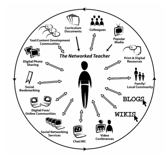
As a preliminary activity for my thesis unit plan, I plan on doing an identity mapping activity with my students. I would like this to become more than just a ven diagram of sorts, I would like them to create artistic and creative diagrams from the activity. However, I am coming up dry on how to go about doing this and full of many questions...what sort of diagram, how to diagram coherently and creatively, what materials, what structure should it have, what should it look like, etc. I am open to any suggestions!!! As a side note, while google image searching, I came across this diagram that might be of cyberpedagogical interest:
The Networked Teacher.png

Friday, April 17, 2009

Pedagogical DNA for the 21st Century?

Ewwwwwwww!

If this isn't a good enough reason to deter you from eating fast food, I don't know what is...

Wednesday, April 15, 2009

Web Crit #10: Chicago Artists Coalition


Content: The about CAC page sums it up simply, a big plus. The benefits of joining CAC are clear throughout the site. Galleries of images, images, and more images! Life couldn't get any better! CACTV...love it. Throughout this course, I have realized how much I really appreciate learning information through a variety of medias on the web. Having a mix of general written 'official content', a more informal blog, photos and images, audio, and video makes me one highly stimulated happy camper. 

Design: I feel like the site could maybe use a tiny face lift when it comes to design. Not loving the shades red and yellow going on. I don't require something super jazzy to impress me, but something a little more interesting would be nice...new colors or template all together maybe...

Usability: Links along the top and side, pretty common...works for me. The Calendar is especially usable. There is a search, but also you can just scroll down the days and pick out events that may be of interest to you to click on for more information, I found this to be very helpful! The Artist Search is also a great tool! I found a couple artists that relate to my thesis.

Tuesday, April 14, 2009

My Obsession...

My video essay for class was placed on YouTube, but Mr. Sinatra won't allow me to sample his music, so the audio has been removed, much to my dismay! Since the music is half the fun, I am uploading it here for your perusal. Enjoy my obsession. 


As a perfectionist, I wanted the cuts to be seem less...but apparently my 4am editing mindset didn't realize the faults in it. I was almost unwilling to post it because of the faults, but when I get the energy to do another 4 hour shoot, I will reattempt it. 

Monday, April 13, 2009

Tuesday, April 7, 2009

Art Teacher Accessories?

Okay...it is pretty known I am accessories/shoes/bags obsessed, so I thought I'd share some recent finds that might call to the art teacher in you:


Monday, April 6, 2009

Video Project Inspiration..

I just came across some inspiration for our video project...a bit ambitious for me, but it is personal and fun at the same time,what I am aiming for. Check it out, I think you will like it!


P.S. Do I post on here too much? Eeeek, I get a little blog-happy I think. 

Oh Iowa...

Oh, Iowa, no offense...I never thought much of you, but maybe I shouldn't of judged a book by its seemingly boring cover. Although unrelated to the arts and education, I still feel it is important to mention, if you haven't heard....


Thursday, April 2, 2009

Web Crit #9: Street Level Youth Media

Content: I know a little about Street-Level Youth Media because we have this project installation from Street-Level at the Children's Museum. It is actually a really cool concept that incorporates video and audio of the kids who worked on the drawings of their neighborhoods and talking about community. They even have some of the videos that are played in the exhibit on the site, great connection! I love the concept of the project, and furthermore that of Street-Level in general too. Their mission statement speaks to my heart! Love it!! And the offerings of workshops for youth seem exciting and great opportunities...if only i was a couple years younger...

Design: Once I got past the introduction page with the revolving icons, I liked it. That introduction page didn't wow me. But I like the general site design, it isn't boring, but isn't crazy either. I like the transparency layers of photos on the pages. 

Usability: Overall, it is a very usable site. Main links across the top are logical and the side links are easy to spot. I like the contact information atop every page, always a good thing!

Friday, March 27, 2009

chuck chuck bo-buck banana fanna...

Some Chuck Close goodness....

Full interview with Charlie Rose


And for something a little more mature. :P

Thursday, March 26, 2009

Web Crit #8: Mess Hall

Mess Hall

Content:Images galore. I love photos of recent and previously shown work. As for other content, I was left somewhat confused, even though I have heard people rave about Mess Hall a couple times now. 

Design:I don't know what it is, but I really like the design and the changing photos on the home page really grab my interest. It isn't too much at all. 

Usability: Ummm, in general, I agree with Caitlin's reaction to the site/organization. I'm left thinking "huh? what?" and as if I'm not meant to get it. And it doesn't have regular hours to visit, huh? and link navigation is not great, I would appreciate one main link bar, instead of haphazardly placed links. 

Web Crit #8: Pros Art Studio


Content:Description on the front page, whoohoo! And it is always great when there is a Calendar. And I love the History info. 

Design:It's okay, I'm not in love with it. I would like some more color.  I do not enjoy scrolling down to read the narrow paragraph of text on the left side of the home page though. 

Usability:Overall, the main links were pretty straight forward and didn't have to think twice to get where I was going. 

Web Crit #8: Chicago Art Department


Content: Love that they have a project exploring Twitter, ha! I'm very interested to see what comes of this art 'performance' based on twitter this Saturday. Their "Video About CAD" was very interesting and helpful into understanding the organization. Their About page is extensive and clear. There is tons of exhibition information and photos, which I am always grateful for.Workshop and Class info readily available. And they have a blog!! Content gets an A! 


Design: I actually really like the design, it kept my interest with each page. I like the different side bar imagery. It is changing but not ever distracting. 

Usability: I found it to be quite usable, links seemed pretty intuitive and easy to follow. I didn't have any problems trying to find certain information, so the usability seemed pretty efficient to me!

Tuesday, March 24, 2009

We don't need no education!

Well, yeah we do. But this is our anti-philosophy for teaching that we presented in class for the midterm. My first attempt at really using iMovie, clearly, so much to learn. Enjoy!


Monday, March 23, 2009

Ummm....


Hmmm, I wonder if this was someones thesis project at Wellesley...

Counterpoint Magazine at Wellesley College made this chart showing the virginity rates of various college majors.

Can I student teach here??? Pretty please!

So, now that BOTH of my student teaching site have fallen through, leaving me a little unfocused in my thesis methodology and frustrated with the start/stop nature of this process thus far, I think I am just going to propose this site for my teaching. Teaching through self-expression!? What a concept! :P 


But wouldn't it be cooler if all the kids had to be painted blue as part of the school uniform?

Saturday, March 21, 2009

Tuesday, March 17, 2009

Art, I want you...Art, you make it pretty hard not to...

Wow, I've found some pretty weird/interesting/cool things on the Internet, specifically YouTube, lately so I thought I ought to do a post to share them with you all...

Are you hungry??

I wonder if he is sponsored by Crayola...


Sing a little diddy about art...


Monday, March 16, 2009

Kohler Arts Center anyone??

I know we briefly talked about doing a day trip out to the Kohler Arts Center in a past NAEA meeting, but let's start planning people!! I am so eager to get out there, it seems like such a great space! I am foaming at the mouth with a pair of my favorite artists, Walter Martin & Paloma Munoz, showing there and now this:
"The Washrooms" exhibition commissioned a different artist for each bathroom in the arts center. Each one is so vastly different and interesting...all i need to know now is: Are they going to let me into the men's room to check out what's going on in there too...ummm, artistically, that is...


Sunday, March 15, 2009

Web Crit #7: Three Walls


Content: Is it because I am now a blogger myself, that I get so excited when organizations have blogs? A blog and store information, and I am a happy camper. The About page was supremely helpful, because I didn't have a clue when I fist went to the Three Walls page. Having a Calendar is always helpful and appreciated as well. It would be nice if an actual address and contact information was more readily available though. I also like the extensive artist information and images included of course.

Design: It works for me. It doesn't wow me, but it works for me. 

Usability: Sidebar links are pretty easy to navigate. The organization is logical and makes sense to me. I understand the need for support for the organization, but I would prefer t0 find contact information linked at the top of every single page as opposed to the "Give Us A Hand" link atop each page. 

Web Crit #7: MCA

Museum of Contemporary Art-Chicago

Content: First of all, MCA audio tours and podcasts, Whooo!!! I love when museums offer these resources right on their page. Oh, oh, games and quizzes too?? I aced the Warhol quiz. And I can't wait to see what comes of the MCA blogs, coming soon! Facility rental and opportunities information is a nice addition. It is how I found an internship there last year. But hmmm...I doubt a wedding at the MCA will fit in my budget. But at least I can shop in the MCA shop online, it's all I really need!  There really is so much information here, especially on all the exhibitions, past and present. I appreciate extensive programs, events, and performances information as well. And educator resources to boot?! Watch out, I think the MCA site might get an A+ from me. Why didn't I use the site when I worked there...I never knew it could be so useful!

Design: It might be too much for some people, but I like the flash and changing graphics/imagery on the home page. It isn't too much and the colors are not too too bright, which is good. And photos on every page makes me one happy girl. 

Usability: The main links bar is pretty intuitive and organized well. I can get around in a couple clicks quite easily. Another thing I always appreciate is the essentials posted right on the front page, easily found. The "Plan Your Visit" box on the home page with address, hours, and directions is a something all galleries, museums, and such should have on their home page. 

Thursday, March 12, 2009

Playing Journey will get any crowd excited...

Pillowfight for Peace on Valentine's Day in San Francisco!
I'd love to beat the crap out of people with my pillow, all along singing 80s pop rock!

Monday, March 9, 2009

Techno Whoa!!

Johnny Lee's Wii hack is my new favorite thing! If you are on a budget and don't have a couple thousand bucks to drop on a digital whiteboard for your class, THIS is an awesome way to make it happen VERY cheaply!


Am I becoming a typography dork?

...because I found this to be highly amusing!

Links Galore!

Since, me and Molly will be techno-teaching this week about Blogs, I thought I ought to blog about some blogs! (and in general, links to cool things). 

  • Street Art Locator! Cool google maps type program to locate street art all over! I think there MUST be more out there than what is depicted on the map, so I have a feeling this site might work better if updated more fully. (Okay, not a blog, but a cool site I found via a cool art ed blog I will share with you guys this week).
  • In honor of last week's project: (I wish I did something this cool! Midterm project maybe? Haha, I'm kidding myself.)

Granted, all these may not be blogs, I found them all through blogs I frequent, which to me shows how great of a resource blog communities can be!

Thursday, March 5, 2009

Wanna go shooting? Eeek!

I found this online a few days ago. It made me think of "Stranger with a Camera" People always look at me funny when I say I'm going to go shooting as it is. 

Web Crit #6: AREA

Content: I am somewhat familiar with AREA from John's class and had actually meant to check out their site after we had a presenter from AREA, but I never did do it. So I am glad I finally am getting to check it out, it seems nothing gets done lately unless it is assigned by an SAIC professor. Notes for People's Atlas of Chicago is my favorite thing on the site and aligns perfectly with my thesis! I could look through a countless number of these all day! I like that there is a brief description on the main page that succinctly sums up what AREA is. However, because of all the 'blahhhh' happening, it was hard to notice that tiny paragraph. Newsletters listed chronologically is helpful. 

Design: Can I get some color pleaseeeeeeee? Pretty please! I beg you, It is like being underwater without an oxygen tank!

Usability: Organizationally, I don't get it. I cannot seem to figure out how to get around, or what is where.  I mean I can see the teeny tiny links on the left, but they are hardly noticeable or stand out. And spatially I get a little confused, because of the small type used in places. I'm just rather annoyed with the column template. 

Web Crit #6: Experimental Sound Studio

Content: The mission and explanation of the Experimental Sound Studio is clearly given and easy to find, which I greatly appreciate. It seems that having such an extensive creative audio archive is a great resource. I love that they offer workshops and tutorials, with information readily available about them and dates. They basically cover the board on all aspects of their organization, which is great, because a well-rounded site, covering all functions/parts of the organization/company is important.

Design: I am a bit bored by the colors and design. I would love to see something a bit more complex and colorful. 

Usability: I appreciate that the name, address, and phone number is a constant header on each page. The links are easy enough to navigate and having the event calendar readily available on every page is a great addition. 

Monday, March 2, 2009

Topical? Definitely!

I have tendency to be random in my postings, though I think they have some thin thread of connection to either art, technology, or education. But for once, this post is a direct hit....I think. Whatever, it's funny. 


Books come to life


This Is Where We Live from 4th Estate on Vimeo.

Saturday, February 28, 2009

Web Crit #5: Stockyard Institute


Content: Some projects were a bit unclear to me, so the links to a Flickr account with photographs really helps you grasp the concept and make connections. Having the audio linked to projects, such as the Pedagogical Factory, is a wonderful inclusion to the site. More bio information and links would be nice for the people involved. More information explaining the site overall would be nice.

Design: The design concept of the scroll bar contained windows within the window is not something I find to be efficient, innovative, or a good look. And then scrolling through the inner window to get to other projects is not very efficient either, Links along the side, listing all projects would be much better. However, some of the backgrounds are interesting looking. 

Usability:I don't really get the idea behind having the What's New section ( the Blog) inside a scroll bar window on the main page. I would much rather have a link to the blog on a separate page. And then to find this format throughout the site is not user friendly to me. It isn't that hindering, but it is rather annoying to me. Though it is nice that there is an option to download their brochure, if you are someone that prefers looking at information not on the web. 

Art Intervention in Place

I wish I could have been there for this. Artist Graziano Cecchini released ginormous bags of ball pit balls on the Spanish Steps. He then promptly got arrested. 


Wednesday, February 25, 2009

numnah

I've always loved this clip.


Childhood scenes

This is cute, I had to share. 


But I also have to wonder...is a kid with a mullet really the marrying kind?

Monday, February 23, 2009

Going in reverse???

Today, in the midst of my usual Monday morning class, that causes ever-mounting stress levels, I came to the realization that I am going back to my original thesis plan. Dates, assignments, and chaos were being thrown around (as usual) and I was just sitting there thinking I need to be on track already, John was right to push us last semester. 

Choosing a new topic area has only led to more stress, for I am unable to find a meaningful and trans formative angle upon which to analyze it and/or way to develop lesson plans around it. And when 'Manic Monday' as I call her, demanded an answer to her question, "Why are you going to do double the work?!" I just stared at her at first, because of course, I don't want to, but I am unable to develop lessons around a directionless thesis. The wheels began to turn from there and very quickly I realized I have put a considerable chunk of my time into my previously selected thesis topic, and to abandon it might be careless thinking. So I am back to my previous topic, Place-based educations role in identity formation in urban spaces. I have mixed emotions about this...when I first made the decision sitting there in class, in my own world, thinking, I suddenly felt relief and a weight lifted off me; I had direction again. But I also felt mild defeat by hopes of trying to branch out of that. Overall, I think it is the right decision to make. 

The only downside is: All the work I put into looking into the topic and starting research is out the window, because I threw it all out when I selected a new thesis topic this semester. A bit hasty? Yes. Am I hugely regretting it? Oh Yes!!!

Friday, February 20, 2009

Bunnyrific!

If you didn't click on my link to the Brokeback Bunnies in my previous post, the page I found via Art Education 2.0, I am here to tell you that you need to check these out. Feature films reenacted by bunnies in 30 seconds. A truly excellent waste of time. (And for some reason, I feel like this is something Mary would especially
appreciate, ha, so I hope you read this and check it out!)


A couple of my favorites: 


Lesson of the day? Everything is better when done by bunnies!

Web Crit #4: Art Education 2.0 Network Network Network!

5th post since class this week, WhooHoo! I give myself a gold star! Hey, I need the self encouragement and patting on the back at this point, Thesis combined with C&I are slowly but surely deflating me.  Oh well, here is the final web crit for the week...

  • Content: Anything that gets educators talking and to each other, sharing ideas, information, and problem solving is a great thing in my opinion. I often think about the cushy group of support, resources, and commiseraters you have when you are in school, as we do in the Art Ed program at SAIC, and I am thankful I am not alone in this, not the only one struggling to make it, trying to understand how to put things together, and discovering new information at each turn of a corner. I remember in undergrad, professors warning us to take advantage of critiques and academic mentors and peers of the community in general, for you would not have this sense of community and resources for guidance and feedback in the real world. I also remember not really heeding their advice and really regretting it once out of school. The point of my extraneous tangent being: I think life as an educator can become quite isolating if people do not make the effort to be active in the community, and this site seems like a great way to counter that and become involved in the discourse surrounding arts education as well as the very changing face of arts ed in the realm of digital technologies. Unfortunately, it won't let me fully explore the site, without joining, but form the main page I have a good grasp of what the site encompasses. A Forum, Blogs, Photos, Videos, Activities, Interest-based groups, and a community of support makes me one happy educator...and serves my ADD tendencies well. 
  • Design: Easy on the eyes. Well, it definitely isn't bland, and I felt pleased immediately when the page loaded. There is a lot on the main page and scrolling down pretty far is in order, but I didn't seem to mind as I do on the SAIC Portal. 
  • Usability: Main Tabs delineate what goes where, and seems easy enough to find what you are looking for. When I can find something as entertaining and amazing as this within 30 seconds of perusing the page, I call that VERY usable! Aw, man, now I am going to be up for another hour voraciously watching all of these! Thank you Art Ed 2.o! 

Web Crit #4: ArtsEdge

Another one...

  • Content: 'Interdisciplinary curriculum' is music to my ears! Professional resources make it sound even better! Free teaching materials and guidelines you say?! Okay, I am definitely IN!  There is a lot here to check out. Not as exciting as CAN, but definitely useful. I love the Arts Days Calendar. Art Quotes along the side of pages is a fun little bonus. Featured lessons definitely drew me in too. But, be wary! Those 21st Century Skills are haunting us...in the Advocacy Essentials section, it appeared on the page as the highlighted report! I mean I want 21st Century skills, I have to have them, I need them...right? I mean I think I want them? Ummm, what? 
  • Design: I don't loveeee it, but it isn't bad either. I like that stories and sections have images, and sometimes audio/video components. I'm kind of bored with it to be honest. 
  • Usability: Not ideal link navigation, but it isn't completely burdensome. The 3 general main tabs are good, but then the subheadings beneath them are quite small and I lost them often, and just began to click around on the featured links that popped up in the main screen of that particular tab. 

Thursday, February 19, 2009

Web Crit #4: I can-CAN!

Another round of web crits, here we go...

Community Arts Network
  • Content: Ummm, wow! Where has this great resource been hiding from me?! Who knew there was such a place with up to date current goings on in the art community. Okay, I sat down to get some homework done almost 2 hours ago, starting with these web crits...and thanks to CAN, I haven't actually began till right now. I kept getting intrigued by different articles and looking for more and one thing led to another and I was on the site all night! The site has an endless amount of information and resources, that not only are a good way to keep me informed but they also pumped me up, reminding me that there are people out there actually doing things and making things happen in the arts! And I know it is the place for an SAIC-er for i clicked on the Visual Arts section, and the first words that caught my eye were "critical pedagogy"....aww, this feels like home. 
  • Design: The site isn't flashy, but it isn't bland. It looks clean and simple, but also has photos and videos in certain applicable stories. I'm not annoyed  by the design or disappointed or bored, so I say it is a success in my book!
  • Usability: I absolutely LOVE how the main page has links sectioned off into different interest groups (media, populations, social contexts, and fields) on the left hand side! And I love that stories are listed by most recent and then dated back. Searching is easy, so you can find just what you are looking for too! What more could I ask for really...

Wednesday, February 18, 2009

Crochet Love

I'm supposed to be pulling together keyword definitions for class tonight, but instead I'm steeped in fun things all over the internet. However, this actually relates to my thesis, as artist Robyn Love is definitely bridging the gap between craft and art!


A taste of what goes on in the CCM studio...

Since we are scheduled to take a trip to the Chicago Children's Museum next week, I thought I'd give a little taste of some of the things that go on in the art studio and post this video of an animation project that was done with visiting artist David Candelaria.

CCM has disabled embedding of their videos, so here the link is below...check it out! 


And in case you want to check out something quite cool, check out this 7 minute long animated short by the artist, David Candelaria!

Friday, February 13, 2009

iPod Uses: Sometimes Unnecessary, Sometimes Innovative

Innovative!
Great idea and would be supremely helpful!
(iTunes U)

Unnecessary! Ew. 


(iPod Player on your TP dispenser)


Web Crit #3: SAIC Portal

The day has finally come where I can do a somewhat formal critique of the SAIC portal! Well, in this instance the formality comes from actually writing it down and blogging about it as opposed to complaining to fellow classmates. The best way I can think of to go about my critique of the Portal is a pro (things that I actually appreciate) and con (things that make me pull my hair out) list. So here we go!

Pros:
-The main tabs are easily accessible and lead you to a page encompassing everything under that heading.
-Course Pages are a great addition to create an online class community. Message boards, files, and links allow teachers and students to compile and put out all class information. Message boards, especially, allow class discussions to continue outside the classroom.
-Tons of resources at your disposal. Jobs, opportunities, library access, and much more. 
-Events calendar is easy to find and easy to understand. 
-Student artwork!
-Weather!----->Convenient! 

Cons:
-It is absolutely ridiculous to have to check off a tiny box, that you usually forget is even there, to have a copy of your email saved to your sent mail folder! Unacceptable in my eyes. An email history should be built into all email systems. 
-Overall, I never trust the SAIC email system, I often feel like when I send emails to people, they just float out into cyberspace as if they never were written. I send follow up emails all the time, out of fear that the initial email never reached its destination. 
-Too much, too much, too much! The pages are much too cluttered. In each tab, you have to look all over the page to find what you are looking for. 
-Personal announcements! Nice concept, but really they should be in tandem with an email that contains the same announcement. Often, I forget to check announcements all together. 
-Course Pages, an announcement/email would be nice to let students know when something new is posted on their class pages. 
-Course pages vs. Consolidated Course pages----> Confusing!!
-Getting logged out too quickly.
-Ugly design. Bland and too busy with text.


To simply describe what I think of the portal, I use the three C's: Confusing, Convoluted, and Complicated.

Thursday, February 12, 2009

Some Relief?

Monday was a rough day, well not entirely. Our Monday class was teaching K and 1st graders for a couple hours at an elementary school, which went great, in my opinion. I'm always happy when I'm teaching kids and especially when I feel like they are truly enjoying it and learning. However, I came down from my high, when we joined as a class afterwards to discuss: Vague expectations and pseudo-organization began to push my buttons. I like to be on top of things, do my very best, and meet all expectations set forth for me, but this is made difficult when they are unclear and so-called organization is more like chaos. I left there feeling frustrated beyond belief and suddenly very stressed out. This stress made me one very cranky girl. 

Yesterday, relief finally came. I started to think about how stressed I was with school, my thesis, etc. and started to wonder if I was doing the right thing, pursuing my MAT. And then I started thinking about Monday, when I was with the children, drawing and painting. I remembered how happy it made me, how happy teaching art to children always makes me. Even when I'm having an awful morning and am as cranky as can be, once I walk into a classroom full of kids or the studio at the museum, I am ready to go. I am excited to get started, I'm eager to see what the kids will create, and I'm happy as a clam. I leave work feeling fulfilled and in good spirits. This is what I must keep in mind as certain aspects of school start to get to me. I know I am here for the right reason, to do what I really love and pursue this passion. Stress will always happen, I just need to manage it with this positive mindset. 

It also helped that in Thesis class last night, we were finally able to get some perspective from a 2nd year MAT. I was beginning to think they all die off after their first year, for every time we had some sort of MAT/MAAE panel of students or presentations by one or the other, it is always always always an MAAE, leaving us MATS feeling irrelevant and unsure of the path ahead of us. She only spoke for around 15minutes, but I suddenly felt as if this is all doable and that someone out there has answers to my many questions. Her perspective was highly appreciated and I wish her talk wasn't cut short. However, then we actually were able to talk about our individual topics as well, which was a nice change of pace, to get it out in the open and get some sort of feedback. 

Overall, things are looking up. I know why I am here. I may get cranky from time to time, but I'm determined to make it till the end. Things may not always be easy, but eventually they will fall into place. I'm sure of it. 

Monday, February 9, 2009

Web Crit #2: Hyde Part Art Center


Content: There is a wealth of information on the Hyde Park Art Center site, from exhibitions to artists to staff to classes to programming information. As far as content, the site does not appear to be lacking in any areas. I could become quickly informed about anything that happens at the Center within a few minutes of clicking around and reading. I think having a blog on the site is a great addition, it gives the site a more personal connection and I like that there can be some additional reflection on the events happening at the Center. I have never visited before and after spending way longer than I had originally intended on the site, I definitely feel like I am missing out! Not only does it look like a great environment to teach kids in with many resources, but I also wish I had known about their course offerings sooner, I would have really liked to take a quilting class to tie into my thesis. Hmmmmm....maybe in the summer? 

Design: Not so much a fan of the site design. The configuration of links and information on the home page is a bit overwhelming. And personally, I get frustrated when differing headings link to the same thing or when there are links on the side and within the main content that link to the same thing: I then feel I have to click on everything to make sure I see it all. For a place that by appearance seems very fresh, innovative, and exciting, I wish the site design was more creative and interesting to the eye. However, I do appreciate the imagery of artwork throughout the site. 

Usability: Love, love, LOVE, that the address, number, and hours are on the front page, why can't everyone do this!? I also like that there is a link to "Getting Here" right away, on the main page. Very user friendly for those just coming to the site to find out where the center is and how to get there. Putting the "Calendar" link right below it on the main page, I also find to be quite helpful and smartly placed. Overall, the basics are very easily accessed, which for me gets 2 thumbs up, because I loathe how sometimes I feel like I search for ten minutes on a site, just to get a phone number. 

Why is this happening to me? Is this going to be forever?

Okay, so I know there has been some debate over this, but I can't help but just love it!! Since this hit the Internet, last week, I've watched it about 25 times.
Discuss.

Tuesday, February 3, 2009

Educational Web Crits #1

  • Chicago Public Schools : When glancing at the list of websites to critique for this week, I groaned at the sight of the Chicago Public Schools website, for past experiences with it have left me frustrated and annoyed. However, this is before I was made aware of its redesign. The new look is much more up to date: simple, yet not boring. The navigation is much less confusing and all information seems more readily available. Searching for schools has been made much easier, especially since there are areas for information regarding preschools, elementary, and high school separately. An area devoted to programming is a nice touch, so one is able to look directly into that information. As an MAT student, yet to enter to CPS system as an educator, the About CPS section is especially helpful with stats and policies easily found. But I must say my favorite feature is in the Calendar section, the link to "Student days off", this is useful for every potential audience to the page: Parents, students, and educators. Even to me, a non CPS educator, it is helpful to have this information compiled and easy to find, for when CPS is out of school, I know that my studio at the Chicago Children's Museum will be packed that day and I am able to better prepare...or hide.
  • National Art Education Association: I have never actually checked out the NAEA site, and I am now quite glad I did, as it seems to carry a wide breadth of information along with many ways to join the community. Aesthetically, I enjoy the artwork and photos throughout the site, especially the ones flashing on the homepage as it grabs interest right away. Another site that seems well organized, simple, and pretty straight forward. The grants and opportunities section is nice to have on the main links bar, so educators can directly look into how to pursue such opportunities. A sense of community is instilled throughout the website, including a blog of mentors and a list-serv that members can join. 
  • The Art Institute of Chicago: A site I am very familiar with, albeit not entirely satisfied with. There is A LOT of information and artwork contained in their site, but maneuvering through their page formatting and link systems is not easy. If you are a regular visitor to the site, I am sure you have by now figured out how to get around to what you are looking for, but for first time visitors, I am sure it is very overwhelming. Even the home page can get a little much with a variety of links all over the page and a rather lackluster look to it. I must give them credit for including the museum hours and admission directly on the front page though...I know this might seem a trivial thing to commend them for, but I have been to many a sites where I have had to click around to get to this pertinent information. 

...and now back to coughing my lungs up. Gee, being sick sure is swell! :)

Tuesday, January 27, 2009

Hello fellow Cyberpedders!

As a one time, now reformed, English major, I have a tendency to be long-winded, so I am going to try my best to keep this concise. My name is Amanda. Another tendency of mine is getting rather loud unintentionally, just a little warning. I have many accents, that are utilized much to frequently and can get quite out of control, but lucky for you all, we don't know each other well enough for you to be party to these yet. I strongly suggest you try to determine when I am being sarcastic, for this is most of the time. 

I wear many hats. I am a MAT graduate student. I am a Chicago girl. I am an artist, a photographer by blood. I am an art teacher, mainly at the Chicago Children's Museum. I love all mediums of art. I love photography. I love so-called 'crafts'. I love fashion and design and decor. I love pink. I love grey. I love travel. I love insomnia...okay, not so much. I, clearly, love randomness. 

I think my life goal says a lot about me: To find a suitable career that would make use of all my incredible talents, which include but are not limited to...taking photographs, maintaining a high randomness to relevancy ratio, making the world a better place via my enlightening sarcasm, and naming other people's children (references available upon request).